
14 Feb 2024
If a picture is worth a thousand words, it’s easy to understand why the use of infographics is increasing all of the time. Time is finite and, with millions of organisations constantly fighting for internet users’ attention, infographics can offer one of the most effective ways to communicate with your audience.
However, creating infographics isn’t a new concept, and many businesses have long been using them to promote their products and services on a range of platforms, from their websites to social media. This means it isn’t enough to simply create any old infographic: in order to garner any interest, yours need to be better than the ones that are already out there.
We frequently design infographics for our clients, which help to demonstrate that they know what they’re talking about when it comes to their products or industry. Our content team can then use these in blog posts or content marketing pieces, while our outreach team can use them to build high-quality and relevant backlinks to our clients’ sites.
Here, I’m going to explain what kinds of information is best presented in infographics and outline how you can ensure yours are as effective as possible.
While there are often lots of different ways you can present the same information, there will typically be one option that works best. For example, if you’re announcing the launch of a new product range, a blog post is likely to be the best choice. Or, if you want to let your audience know that you’re currently running an exciting promotion, a few social media posts should do the job.
Infographics tend to work best if you’re looking to present a complex message in a way that means it can be understood at a glance. For example, if there are some stats that can otherwise only be found in a lengthy report, or you’re trying to show the process of doing something, displaying this information using graphics and images, rather than a lot of text, can make it far more digestible.
I’ll now take you through my top tips for creating infographics that will help you achieve the results you’re looking for.
Because infographics are designed to get information across as quickly and effectively as possible, you need to stay focused when creating them. You constantly need to keep your target audience and what you’re trying to achieve in mind, so every part of your design relates to this. You also need to try to keep things simple, without removing any important information. Infographics should tell a story, and you need to ensure there aren’t too many parts to this, or the main message will get lost.
Start the process of creating every infographic by defining its purpose, where you plan to see it published, and what your overall goal is. Then, refer to all of this at every point throughout the creation phase.
When we’re working with a client on an infographic, we’ll typically find that they’re looking to inform, highlight their expertise, or evoke some kind of emotion from their target customers. So, we create all of our design assets in a way that helps them to do this.
To get the engagement you’re looking for, you need to present the right data in the right way. A whopping 90% of the information our brains process each day is visual, so we’re used to digesting information that looks a certain way. I’ll take you through some of the most common types and give you a rough idea of what these infographics will typically look like.
Of course, there’s no one-size-fits-all approach, and you’ll need to decide how to present the data you have on a case by case basis. While tables, charts, and graphs are the most popular ways of displaying information, they mightn’t always work or be memorable. Here’s an example of how the same data can be shown in two different ways.
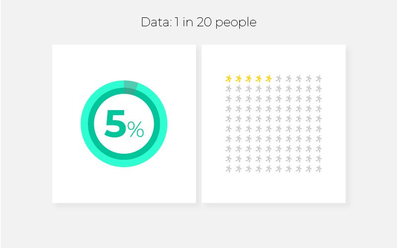
Which version would you remember?
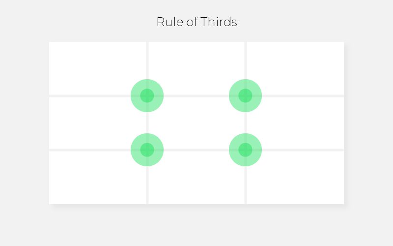
Once you know what your goal is, what information needs to be included, and what your general concept is, you need to start thinking about what it’s actually going to look like. And, one of the most important aspects of this is the layout. You want to ensure everything looks balanced, and that your infographic isn’t too crowded or bare, as this will severely affect how engaging it is.
One of the simplest yet most effective way of getting this right is by using the rule of thirds. This should allow you to control where your audiences will look first, and then you’ll be able to guide them through your story.
You also need to remember the importance of space. Using white space in the design of your infographic will help to prevent it from looking too crowded. But you also need to ensure there isn’t too much blank space, which could cause your design asset to look boring. Designers should be able to use their judgement to determine what amount of blank space is going to be just enough.
The most successful infographics are those that are shared on other websites or social media accounts — and the best are those that go viral for all the right reasons. It’s possible your design asset might also be saved for later use, or added to a Pinterest board for future reference, and you want everyone to know exactly where it came from. So, it’s vital that your infographics are somehow linked to your brand.
Of course, an easy way of doing this is to add your logo, but this might put some sites off sharing it. So, make sure it’s also recognisable as yours by designing it in your brand colours, as well as using your usual fonts. Then, you can create a bank of different versions people might be interested in using.
Making sure the copy is in keeping with your brand voice can also help with this. We have a blog post all about developing your brand voice, which is worth reading if you aren’t confident about yours yet.
It’s important to remember that big isn’t always better when it comes to infographics. As I previously mentioned, you should be able to understand what an infographic is about at a glance, and this will be much most difficult the bigger it is. A lot of data and content can also make engaging with an infographic seem like hard work, so it’s usually best to keep things as simple as possible.
Again, the perfect size will completely depend on what message you’re trying to get across, and what platform you’re making your infographic for. If it’s to be published on a webpage, I would typically make this fill the width of the page, but you still need to ensure your infographic is going to complement any extra content that might be written around it, and that the dimensions work with the message and layout you would like to go with.
Infographics are great if you’re looking to add a visual element to your website’s content, or you want to create valuable design assets that can be outreached in an effort to build links to your site. We offer design as part of our content service so, if this is something you’re interested in doing but don’t currently have the skills or time to explore this, get in touch to see how we can help.

Head of Design & Development